Like Clockwork, WWDC (World Wide Developer Conference) is here and it comes with a new design language.
In episode 36 of the Tech, Productivity & Things Podcast, I spoke about the leaks and rumours of what we can expect in iOS, which centred a new design language and User Interface (UI). Well, it’s finally here and they are calling it Liquid Glass.
The design language of iOS has come a long way from what we are seeing today with iOS 26. Let’s unpack it how iOS has evolved over the years:
History of UI Changes in iOS
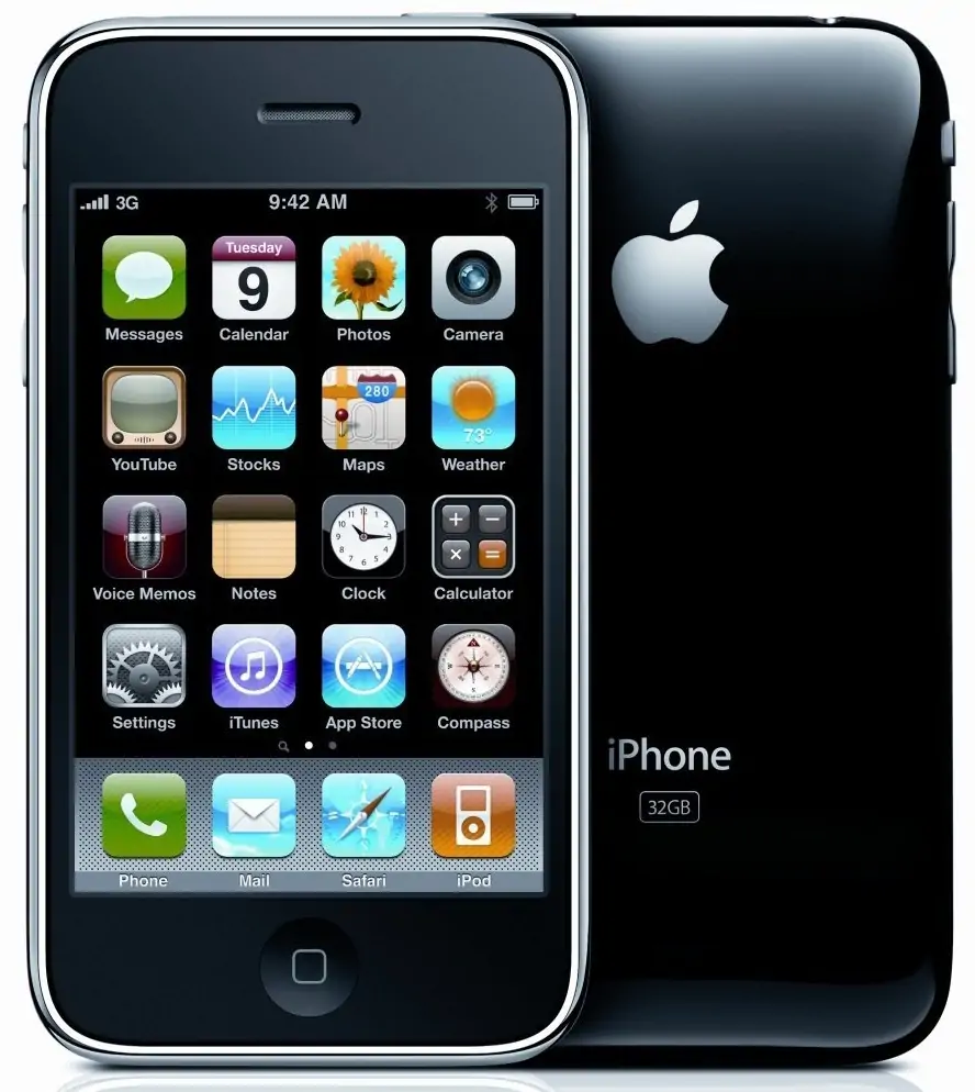
Since its inception, iOS has now officially undergone 3 major UI updates; the first was in 2007 when the first ever iPhone launched with iPhoneOS 1 (iOS 1), pioneering the touch-centric era of smartphones. iOS 1 had a skeumorphism design language that imitated the form of an object in real life, which made the interface easily understandable to users. Some of the key features of iOS 1 included a multi-touch interface, at a time when smartphones almost all had physical keyboards (i.e., BlackBerry). iOS 1 also had Visual Voicemail, Maps and iTunes integration – features we would raise an eyebrow to today if touted as “innovation”.
The skeumorphic nature of the User Interface (UI) of iOS 1 carried through until iOS 6, when the next big update and evolution of iOS design came with iOS 7.
The era of flat design – iOS 7
iOS 7, released in 2013 ushered in a new era of design for Apple when they embraced the Flat Design User Interface, completely overhauling their UI and moving away from Skeumorphic design. The new design of iOS 7 brought with it a simplified icon design and a vibrant color palette. It had a parallax effect that essentially made the icons ‘float’ above the wallpaper. This overhaul laid a foundation for what we know as iOS today, which was refined and carried over through to iOS 18.

Some of the key features of iOS 7 included; a flat design with adaptive colours, updates to the control and notification centres as well as the introduction of AirDrop to the iPhone after it was initially available on MacOS.
And now comes a new of design at Apple and all their software platforms…
iOS 26 & Liquid Glass: The new age of design

At this year’s WWDC, Apple overhauled their entire operating system user interface and gave it a fresh new look. And this time they also made it uniform across their entire software ecosystem (iOS, VisionOS, WatchOS, MacOS and iPadOS). It’s a user interface that borrows from the physicality of the UI of VisionOS, and they are calling it Liquid Glass. Just as the name suggests, the entire UI is going to be coming to life in a glass-like look and feel across the entire OS, with elements that almost make it feel like it comes alive to the touch. This is perhaps the biggest overhaul Apple has ever done since iOS 7 in 2013.
This new design is said to combine the optical qualities of glass, fluidity and it also transforms depending on your content or context.
The core of Liquid Glass is said to feature a concept called Lensing, where real-time light bending creates natural visual cues to distinguish controls while letting content shine through. Unlike previous translucent materials, Liquid Glass adapts live to its environment, effectively shaping light, flexing under interaction, and creating immersive depth.
The highly adaptive nature of the design allows it to:
- Morph in size and complexity, becoming richer and more defined in larger formats like sidebar.
- Auto-adjust for clarity with features like scroll edge effects, subtly separating UI elements from moving content underneath.
- Intelligently toggle between light and dark based on background for legibility all consistent the entire software ecosystem by Apple.
Liquid Glass was also built with two variants; Regular, which adapts fully to environments and is broadly usable. And, Clear, which is more transparent and visually rich but needs contextual support for legibility.
With iOS 26 ushering in this new era of design for Apple, it’ll be interesting to see how developers take advance of the UI elements in their apps and platforms.
As a participant in the Apple Developer Program, I’ll be testing out and sharing more reviews of the complete features and improvements of the new iOS 26 with Liquid Glass.